A portrait photography is a portrait of someone and that shows what they like to do or things they like. For more information here is a link that can tell you it better, portait photography. It can be like a profile view because it shows there face but a portrait is only one side of the face. It also kinda like a silhouetting because it only show one side of there face but most silhouetting is one main color. silhouetting
To make a double exposure you first have to take a picture of you or someone. Then take 2 pictures of things you like or things you like to do. Then go on photoshop, -> file->stack files. When you have the photos make sure the top picture is the portrait.Then you go on the dodge tool and only outline your body. If you want to size the any of the pictures hold shift. Then you double click layer
-> blend mode->screen. To have different colors you click layer-> new adjustment -> now explore.
-> blend mode->screen. To have different colors you click layer-> new adjustment -> now explore.
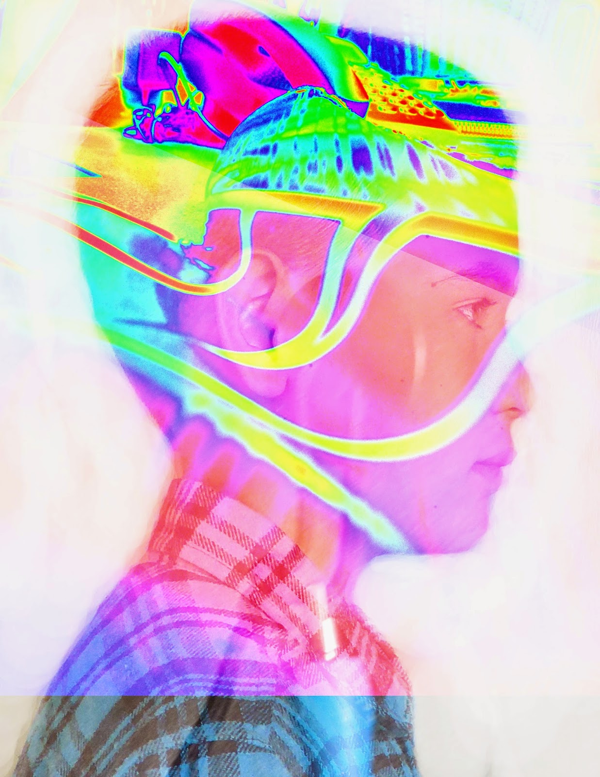
The left visual was a practice one and it could of been improved by seeing the pictures a little better and adding some other features. The 2 textrues is a stick and a tree. It doesn't show who I am but my final one kinda shoes who I am. My final one is a picture of my football glove and my bodyboard. I could improve by being able to see the textures. You can't really tell but the glove and my bodyboard are the things that repesent me.

I really like the abstractness, but it doesnt really apply to what we were supposed to acheive.
ReplyDeleteI cant even tell what your symbols are.
Definately change the colors.
I really love the content of your paragraphs.
ReplyDeleteOne thing that could be improved is the message of your pictures.
I really love how unique your pictures are.
I cant really see your symbols very well but the colors look very abstract and I think thats pretty cool! I also like how with the dodge tool you added a little bit of texture with the dodge tool.
ReplyDeleteI like the colors
ReplyDeleteYou can't tell what you symbolism is
I like your profile images
The colors look nice but it could use more fading.
ReplyDeletethe practice is good
ReplyDeleteyou dont really know what the symbols are
your picture for the profile on the final is good.
I like how abstract it is.
ReplyDeleteI cant see the bodyboard and the glove.
Make it so we can see the glove and the bodyboard. I cant see what you are trying to tell me.
My favorite part of your work is the colors and how its abstract.
ReplyDeleteYour message does not work because you cant see your symbols clearly.
Your quality of work could of improved by making your symbols show.
I like your practice.
ReplyDeleteYou cant see the symbols you chose.
I like the abstract in your practice.
I like your practice! It looks like you have a texture on you
ReplyDeleteI can't really see your symbols, and its really abstract.
Good job! :D
really awesome pictures
ReplyDeletecant tell what the photos are of
very colorfullllllllllll :)
Compliment: Great color and the vibrance is amazing
ReplyDeleteImprovement: Your symbolism aren't showing
Compliment:Amazing images overall